Friday, June 24, 2011

A look at 2011 so far.

Hello Everyone!
I am so glad and honored for you to join me here at my blog! I am updating with the images I have of my work over this past semester and a few comments in each work of art.

In February of 2011 I had a Solo Show at Winthrop University. Here are some of the images:


Works in Progress show at Withrop University ove the summer

I took part in the Works In Progress show in one of the galleries at Winthrop University.
Here are some of the Images:


Solo show

Dear Friends,
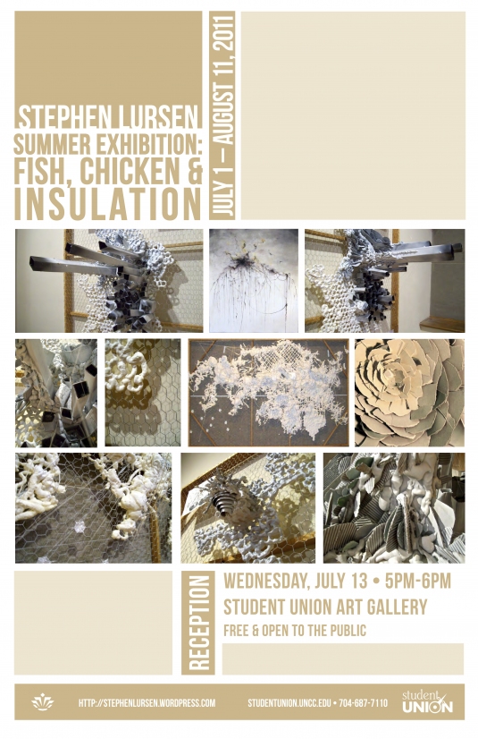
I have a solo show at the University of North Carolina at Charlotte, this Summer and I would love for you to join me!

I chose the title: Summer Exhibition: Fish, Chicken and Insulation because of many reasons. Firstly, I am showing a little of my humor without officially revealing (in the Poster) that most the time I act like a teen. Also, in my experimentation with materials, I have used a significant amount of Fishing Line, Chicken Wire, and Polyurethane spray foam insulation. After I put this together in my brain I thought it makes perfect sense.

So the last thing to explain is the beginning “Summer Exhibition” part… Well… I think you already get that part.

Here are the posters!


Tuesday, April 5, 2011

Watercolor updates

Dear readers, I apologize for the lengthy absence. I have been hard at work in art and have much to upload and show you!


"Untitled"
Watercolor, ink, graphite and salt on watercolor paper
22" x 30"

"Untitled"
Watercolor, ink, and salt on watercolor paper
22" x 30"

"Hibiscus"
Watercolor, ink and salt on watercolor paper
22" x 30"

"Untitled"
Watercolor, ink and salt on watercolor paper
22" x 30"

"Untitled"
Watercolor, markers, ink and salt on watercolor paper
22" x 30"

"Untitled"
Watercolor, ink and salt on watercolor paper
22" x 30"

"And Grey Flies Over the Field of Color"
Watercolor, graphite, charcoal and ink on watercolor paper.
22" x 30"

"What's inside the clock tower?"
Watercolor and charcoal on watercolor paper
22" x 30"

"Linear Light"
Watercolor and black & white charcoal on watercolor paper
22" x 30"

"Line Frenzy"
Watercolor, Acrylic, Matt Medium Transfer and ink on watercolor paper
28" x 40"

"Untitled"
Watercolor, ink and salt on watercolor paper
22" x 30"

"Untitled"
Watercolor, ink and salt on watercolor paper
22" x 30"

"Untitled"
Watercolor, ink and salt on watercolor paper
22" x 30"
SOLD

Friday, December 10, 2010

My Visit to the Jerald Melberg Gallery

Jerald Melberg Gallery
Charlotte, NC

On Friday October 29th, 2010 I was greeted in the gallery by Janet Wall who had generously pulled out over 10 original Rutenberg pieces for me in advance. She walked me to the private viewing room and after a brief introduction of myself and why I was there, she proceeded to tell me about her experiences with Brian and his art. She came from the art business point of view and had some interesting insights, but when talking about going to Brian’s New York Studio, she said she couldn’t wait to get out. “I don’t like to get dirty” she said and from the various pictures and videos I have seen of Brian’s studio I get the feeling it gets pretty filled with paint, as it should, paint that could cover any person who may slip or trip and fall in the wrong direction.

After an hour or so of conversation, Janet introduced me to a man named Chris Clamp. He is an artist and alumni from Winthrop University who discussed Brian’s work from an artist’s point of view. He answered as many questions as he could and spared nothing, when something new came up in conversation he would go to the back and pull out yet another of Brian’s pieces. I got to see a number of his large works on linen, some of his medium sized works on canvas and paper, and then later even some of his monoprints that he made during his time at the “Atelier” program. The interesting thing about his prints is that he didn’t leave any the way they were. He made each one individual by adding an additional layer of paint to each print to make each unique.

I was able to sit down after talking with Chris for over an hour and just look at all the paintings sitting out before me and around me on the walls and on the floor and I was truthfully elated and felt as though it couldn’t be true. I was glad I dressed up for the meeting, I thought to myself with a grin.

After flipping through the Galleries copy of the book Brian Rutenberg; a book that is currently sold out almost everywhere and out of print to boot, and after taking ten and a half pages of notes in my sketch book, I got up to walk around the gallery to see what else I could pack into my time there. I saw a number of beautiful pieces, but nothing quite compares in my opinion and aesthetic to Brian’s pieces filled with an abundance of rich color.

Before leaving I introduced myself to the receptionist who had arrived after I did, thanked her for allowing me to visit, and headed on my way with a smile and a boost of motivation and passion about making art.

Friday, December 3, 2010

Art criticism

My first piece of art criticism on Pamela Winegard’s opening at Winthrop University. November 8, 2010.

In all actuality the atmosphere created by the lighting, and intense effort to hang the work in the best way possible create a powerful sense of… reverence. I use this word because of the weightlessness of the works on paper and even the two more recent triptychs in the room on the left. Each piece glows with a halo of light, symbolic of a formerly religious reference. This presentation style contributes to the work, empowering spiritual undertones, more than they would have if hung in a less dramatic way.

“Ash Pit”, 2010 – Encoustic and Mixed Media on Panel. Ash Pit speaks volumes to my imagination because of the choice of blue and cream relief sculpture behind the window of a hard wire grid cut open. The faces are anonymous yet different, they are downcast as though they are indwelt by the spirits of some of the victims passed over a half a century ago – sleeping, waking, and then moving on to another resting place leaving the faces soulless once again.

The cumulative work as a whole evolves into a more serene and masked version of itself. The two triptychs entitled “Gornisht”, 2010 encaustic on panel and “Memory”, 2010 encaustic on panel, differ in execution of line work, but remain consistent in concept. In my opinion, “Gornisht” is the more successful of the two because the color and shape of the line work cut into the purity and serenity of the white negative space unlike “Memory”. The blade-like shapes created in “Gornisht” sharply cut, speaking as a metaphor for the process, wherein the artist carves away the top layers of white wax to reveal the under layers of cool blue and green. The color choice of the blade shapes contrasts the white background not only in value, but in temperature and creates a cold and mysterious mood.
The work is serious. It is not playful; it does not make light of the issues of the holocaust or the generational witnessing of it.

Her work is now down. She has since installed “Gornisht” in the MFA show entitled Line at the Loading Dock Gallery in Rock Hill, SC. Line had its opening last night were myself and others in the program presented our work.

If you are interested in seeing or reading more about Pamela’s art you can visit her website: http://www.pamelawinegard.com/index.html

Saturday, October 30, 2010

Jerald Melberg Gallery

Today, I spent 3 hours at the Jerald Melberg Gallery in Charlotte, NC. I had a wonderful time with some of the most generous people there. They took the time to take out 10 original paintings on linen, canvas, and paper. I learned so much all the while jaw dropped by the fantastic art. I am so impressed by what I have seen and can not keep from internalizing it and am sure that it will change the art I make.

Now I am needing to plan a trip to New York, because they said that if I am going to be in NY, then they would ask for a meeting for me with Brian Rutenberg. Crossing my fingers and hoping.

Anyway, just wanted to share the good news.

Thanks for joining me!
Stephen

Thursday, October 14, 2010

A couple of my inspirations

I have found two artists with whom I am currently infatuated because of their use of color specifically and the contrast within each piece of muted vs. saturated. Mark Gould’s paintings have passages within them that are applied in a non representational way, but when made part of the whole, make sense more as an abstraction of something without fully knowing what it is. I appreciate the contrast between the recognizable and the unrecognizable. 


The second artist’s work I am infatuated with is Brian Rutenberg’s. He also deals with representing the natural world, but adopts Francis Bacon’s belief that “The job of the artist is always to deepen the mystery” (Brimming Tides, Mark Sloan, pg. 4). THe way he deepens the mystery is by abstracting even more than Gould. His passages that appear non-representational take up a much larger percentage of the whole and leave only traces, a bone structure if you will, of the subject matter of the natural world.

They have inspired me to not only use more color, but be smarter about it. Using contrasts to strengthen the piece and avoid muddying the paint in the process. Using Muted areas that by contrast make the brighter saturated colors really shine. And also, I have learned from them that realism isn’t necessarily the best way to communicate the beauty of nature or of anything for that matter so long as you do what you do well. And, if you do what you do well, then no one can/should stop you from succeeding at it.

Sincerely,
Stephen


Gallery Opening Tonight in Columbia, South Carolina

Dear Friends,
There will be a gallery opening this evening and tomorrow evening at Gallery 80808 in Columbia, South Carolina. Tonight, my friend and colleague Jon Prichard will be performing a rendition of his thesis show that he will be performing at Winthrop University in early December.

Tomorrow Night (Friday October 15th) The 2D show will have an opening at the same Gallery. I am fortunate to have two pieces in the show and would be honored if anyone would see it. I will do my best to get an image of the pieces as they hang and post it for the majority who cant travel across the South East for an art show opening.

Thank you so much,
Stephen Lursen


Gallery 80808
808 Lady St, Columbia, SC 29201 Map
803 252-6134
Hello Again Friends,

I have updated my Flickr.com Gallery and would love for you to check it out.

http://www.flickr.com/photos/stephenlursen

Also, I just sold another painting to Starbucks Coffee Company. I hung the 8′ x 4′ piece in the Dilworth Store last Wednesday afternoon.

The store is at:
1401 East Boulevard
Charlotte, NC 28203
7043389911

Looking forward to further updates,
Stephen