Wednesday, October 23, 2013

Feeling creative? Get your paint on!!!

If you are feeling creative and want to get your paint on, then reserve your spot for Friday night 10/25/13 at Donna Downey studios with me! Seats are limited so sign up online
@ http://www.donnadowney.com/studio-workshops/paint-and-pour-fall-favorites-friday-night-october-25th-6-30pm-9-30pm.html


Soft pastel over acrylic and gold leaf - mixed media painting

I am pushing myself to continue experimenting and creating new types of visual art. I will be quite honest and go ahead and say that I have no self-perceived unique style that carries from painting to painting, and I am ok with that.  I know that I could take any work of art I have made, create 9 similar to that one and then I could show a series of paintings that would communicate my "style". But, because I don't want to do that right now, I keep pressing onward.

I took an old painting of mine that was sitting on the floor of the studio and desperately wanted to change it. I've never liked it so I felt I had nothing to lose.

Here is what the painting used to look like:


I painted the whole thing over again with acrylic paint. I intentionally left the gold leaf untouched. despite hours of painting, I was never satisfied. I needed to make a change. So I put down the brushes and paints and decided to work with a whole new medium. I found Soft Pastels! I hadn't used pastels since a large scale oil pastel painting in 2006. And those were oil based and these are not.  So I basically had no experience with them. Exciting! :)

Here is the final result after working with the pastels. I am happy with it and glad I changed media.


Abstract Landscape - revisited and finished

I graduated from Grad School in May of 2012 with my M.F.A. which meant that for the first time in 3 years I was free to paint as an artist without the pressure of obligatory defense.  Don't get me wrong, now that over a year has passed, I would enjoy going to a critique discussing art. It's just that in June of 2012 All I had ever known as an artist, was synchronized with being a student for... (let's see, K-12, then 4.5 years of undergrad, then 3 years of grad school...) a long time.

So the very first painting I made as a free man (from school) was this painting:


I used oil paint and painted for 2 days on and off until I felt I was finished.  I painted this while inspired by Brian Rutenberg's many catalog images/prints were scattered across my desk.  Late in 2012 I ended up finishing a large oil painting commission and delivered it. Soon after, I was approached by a representative from my former middle school who was requesting art supplies for their art club.  I chose to donate 100% of my oil painting supplies because I didn't know how long it would be until I wanted/needed oil paints again.  As a result, I haven't made any oil paintings since.

And yet this painting still leaned against the wall calling out to be updated.  For months I have wanted to work on this painting, but all I have are watercolors and acrylics, neither of which can be used to paint over an oil painting. Oil paint can go over everything, but water based art supplies won't stick to it.

Then it hit me! I could use oil pastels! They are very different than paints, oil paint dries over time to a hard waterproof surface but oil pastels never dry, they remain sticky and workable forever. but that was all I had access to, so I took the plunge. 

This morning I set up my studio outside on the back patio:


I work at Donna Downey Studios and in the studio we have 2 large books on Wolf Kahn's pastel paintings.  Since I see these regularly, his high energy, textural, mark making was on my mind.  I started with the warm area of the painting feverishly swiping the pastel across the surface.  The painting has so much thick texture already that is made it hard to produce any long lines.


Once I came to this point I thought the top and bottom were too disjointed. I continued working, trading one color out for another, usually working in color families before moving to a higher contrast option. For me it is all about color. I wanted energy, small bits of color contrasting the larger areas of color beneath them. I added the diagonal lines of blues to help with the composition. 

Eventually, satisfied: 


I thought about my options for storing for this painting. I intend on selling it once I have a buyer... But what to do with it until then?... I've got it! (we'll see what my wife has to say about it when she gets home. Hahaha!)


Monday, October 21, 2013

Finished Sacco Family Portrait!

I am so fortunate to have such a supportive family.  My Uncle Tommy, Aunt Trish, and Cousin Christopher now have a family portrait hanging in their home. My brother and I delivered the painting last Friday and unveiled it.  It is so large that it may be hung in their 2 story foyer instead of over the mantel. I had such a wonderful time that all the work was more than worth it. Here is a quick picture I snapped with my iphone before leaving. If I can get my hands on a DSLR camera for Thanksgiving then I will get a better picture then.  It is my favorite holiday and it is always at their house. I'm so looking forward to seeing everyone again!


Thursday, October 17, 2013

Color, Figure, Text. A painting.

I have been painting over old paintings recently to reduce additional storage needs and also saving on purchasing new canvas materials.  I finished an update (a.k.a. painted over an old painting) today and I must say I am pretty happy with it.  I still have this incessant need to keep working and working, but once I realized what I was doing I washed away the paint while it was still wet.  This painting already has a lot going on and I think I should accept that. So I am finished for now. :)

"The greater the obstacle, the more glory in overcoming it."
Acrylic and collaged paper on canvas
16"x20"
2010 - 2013

Wednesday, October 16, 2013

Painting inspired by Jylian Gustlin

I have many artists who inspire me. I frequently surf the internet for paintings that give me a "Wow" moment. If you go to http://www.jyliangustlin.com/newart11.html, then you would see numerous beautiful figurative paintings that have a focus on color, texture, and composition, rather than rendering features.
So after looking at a number of Jylian's paintings I decided to do a small exercise on my own. The painting below is mine. The addition of the book text gives some insight to scale. This painting is only 8"x10". I used acrylics, ink, and collaged book text. I tried to be as loose as possible, which gave way to some errors in anatomy, but even so I was too complicated in comparison to Jylian's work.  I am challenging myself to loosen up and refine my art to think and believe less is more.  I really just want to understand it.  I have always been confused by the statement less is more and favored More is More. That's part of my literal and excessive personality I guess. :)


Here is an example of Jylian's work:


After further review, Jylian paints passages, I don't know if the figure is really relevant to the passage or if an abstract painting is made and then the silhouette is brought to the canvas. The yellow on the thigh makes sense as a highlight, and the blue on both shins makes sense as shadows, but then other areas are perceivably arbitrary. The difficulty in figuring out how Jylian is painting these adds to the inspiration attained from them. Check out more paintings at http://www.jyliangustlin.com/newart11.html

Animal Silhouette Mixed Media Painting


I finished another small, mixed media painting for a potential kid's class.  I used collage (book text, printed photo of fox, ribbon), hot glue for texture, acrylic, and ink. For my adhesives I used Mod Podge, but I highly recommend Golden Matt Medium. It has a better texture, lower odor, and faster drying time.
Let's get started!


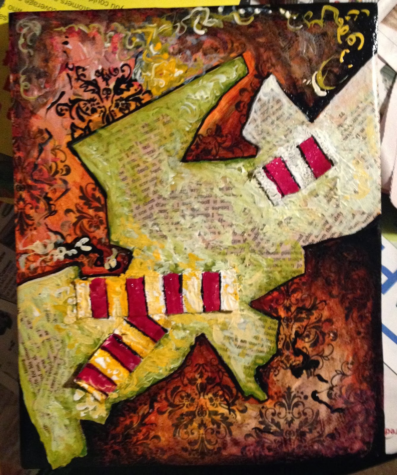
 I started with an 8"x10" canvas and collaged a background of scrap-booking paper. 


Torn book text was applied to add texture and variety.


I cut three pieces of ribbon. I moved them around quite a bit to figure out where I wanted them to go.


Once I decided, I then saturated the ribbon with Mod Podge and placed them.  They wanted to curl up so I tore a piece of wax paper, covered the canvas with it, and stacked books on top to flatten the image.


With black paint and a small brush, I outlined the edge of the book text.


Starting with the background, I began to paint.
Colors used:
Magenta
white
black
yellow ochre
nickel azo gold


I start to paint the book text. Colors used:
green gold
white


I also paint over the ribbon to increase contrast.
White paint (later I will use yellow orange as well.)


Time to print off some silhouettes! I chose foxes because I love their energy.
I printed them off in 3 different sizes to give myself options with my composition and scale.


(foxes cut out)


First one is too big!


That's better. I did move the photo around a bit before deciding where to place the fox.


Mod Podge used to collage it on the canvas.


I used hot glue all over the background creating strings and bumps of clear texture.


Started to paint the fox with a yellow orange.


To add contrast between the fox and the background, I painted the surrounding area white. You can start to see the texture of the hot glue once it is painted over with white (bottom left).


I decided that I wanted to use a complimentary color scheme instead of what I had going on.  So that required me to add blue to the top of the canvas. I also splattered white to give the appearance of stars.


Dont forget to paint your edges if you're not spending the money on framing the art.


I went back and forth with myself about whether or not to use words. The risk is that is controls the viewpoint from which others see the painting.  But I decided I wanted to anyway! Using ink, I drew/wrote the words.  With black paint I painted over much of the ink and then splattered the paint around the area to grunge it up a bit.

Thank you for reading!

Sincerely,
Stephen Lursen

Monday, October 14, 2013

Fall Wreath! Step by Step Tutorial

Thanks for checking out my blog! Here is a step by ste tutorial on how I made my most recent wreath! Low budget too!

Supplies list: old book for its pages. I love the old paperbacks that turn yellow due to being printed on acidic paper. 1 wreath ring (you can also make your own out of a couple old wire coat hangers.) Ribbon. decorative elements - I used some fake berry branches I bought on discount and some cute hedgehogs made out of wood chips also %50 off.  Lastly, I used a hot-glue gun and glue to put everything together.


Books for the book text pages. I used 73 pages for this project.


Ring made specifically for wreath making.


Ribbon.


Twigs with berries.


Little hedgehogs for decoration. adds a cute factor.


Once I have my supplies, the first thing I did was tear out pages of the old book and role them into cones like above.  I made sure to consistently keep the torn edge out/up.  I didn't want to make the wreath have clean cut edges. 


This is a stack of cones. I made over 70 to complete the wreath.


I made the project primarily while looking/working from the back. I did this to maintain access to the ring.


Shot with my glue gun.


This is a picture after the first of three rings are complete.


Mid way through the 2nd ring.


After 2nd ring is complete.


After 3rd ring is complete.


I cut the ribbon and moved it around until I decided on a final position. I made it A-symetrical because looking on pinterest.com at wreaths inspired me to. Once I finalized the placement, I hot glued it into place on the back.


The last things to glue in were the three berry branches and two hedgehogs you see below. The wreath is hung over the door with the same ribbon I used to decorate the wreath with. Also when choosing a ribbon, using one with wired edges gives you more control over the way the ribbon hangs.